Why Do Most Healthcare Systems Look Like They’re Stuck in the Early 2000s?
Table of Content
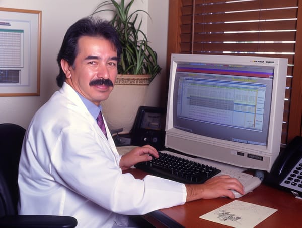
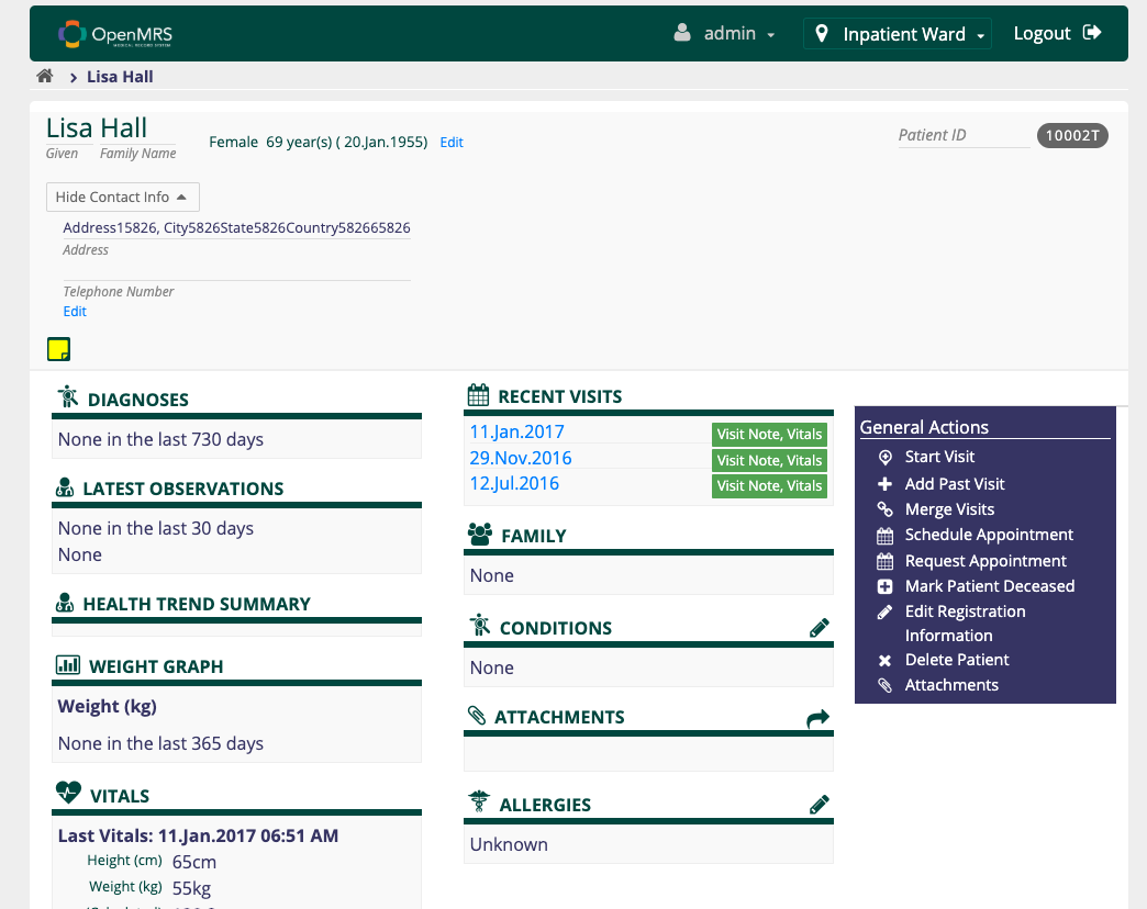
If you’ve ever worked in a hospital or clinic, you’ve probably noticed the software—EMRs, EHRs, HIS, LIMS—looks like it belongs in a museum. Bland colors, clunky interfaces, buttons that scream "Windows XP." Why does it feel like time stopped for these tools?
As a doctor who’s navigated countless hospital systems and a blogger who reviews medical software regularly, I can confirm: this isn’t your imagination. It’s a widespread issue. Here’s why.
Why So Outdated?
1. Legacy Systems Rule
I’ve sat in front of these screens more times than I can count. Many of these systems were designed back in the late 90s or early 2000s, and hospitals poured fortunes into implementing them. Once the money was spent and workflows adjusted, changing direction became a logistical nightmare.
Replacing them isn’t just about cost; it’s about upending familiar processes and risking downtime that no hospital can afford. So, instead of adopting new solutions, these old systems get patched and tweaked, clinging to life like stubborn relics.
The interfaces remain clunky, the buttons unresponsive, and we’re left wondering if the software is helping us or holding us back.

2. If It Ain’t Broke, Don’t Fix It
For hospital administrators, reliability often trumps aesthetics. These systems work. They may not be pretty, but they handle the data without crashing. Why mess with that?
3. Regulatory Roadblocks
Healthcare software is tangled in red tape, and every change must pass through a maze of regulations. Any update needs to meet strict compliance standards like HIPAA, which means more than just a visual refresh. Adding a modern design isn’t a simple matter of hitting "update."
It demands extensive testing, multiple layers of validation, and meticulous certification processes to ensure data privacy and security. One tiny misstep can trigger audits, penalties, or worse—compromise patient confidentiality.
The time and cost required to jump through these hoops often discourage updates altogether.
4. Vendors Stuck in Neutral
Some companies behind these systems don’t feel pressure to innovate. They’ve locked in long-term contracts with hospitals. With no competition breathing down their necks, why evolve?
5. User Training Costs
Doctors, nurses, and lab techs have memorized these systems down to the last awkward button placement and baffling dropdown menu. Want to update the interface to something that doesn’t look like it was designed by a sleep-deprived intern in 1999? Brace yourself.
Retraining staff means extra time, extra money, and a whole lot of groaning. Hospitals would rather keep things as they are—because who doesn’t love navigating a labyrinth of beige screens and outdated icons when you’re trying to save lives? “New and improved” is often just code for “new headache.”
Why This Matters
While these systems technically function, their ancient design is a constant struggle. Slow, clunky interfaces force doctors, nurses, and lab workers to wade through endless clicks and confusing screens. In a high-pressure environment, every wasted second counts.
Worse, the convoluted design increases the risk of errors—one wrong click, a misplaced decimal, or a missed notification can turn into a catastrophe.
Add in the mental gymnastics required to interpret outdated icons, and it’s like healthcare workers are expected to perform miracles with stone-age tools.
Recommendations for Modernizing Healthcare Systems
- Prioritize User Experience
Design systems that reduce clicks, streamline workflows, and display critical information clearly. - Make Interfaces Responsive
Staff use tablets and mobile devices. Systems should adapt to different screen sizes. - Modular Upgrades
Instead of a full overhaul, update sections piece by piece. This eases the transition and reduces downtime. - Involve End Users
Doctors and nurses should test new designs before launch. They know the pain points better than anyone. - Embrace Open Standards
Systems built with interoperability in mind make it easier to upgrade and integrate new tools.
Final Thoughts
Healthcare systems should make life easier for medical staff, not harder. It’s time to move beyond interfaces that feel like fossils from the early 2000s. Modern design doesn’t just look good; it saves time, reduces errors, and, ultimately, saves lives.
It’s not about flashy graphics or sleek aesthetics. It’s about giving doctors and nurses the tools they need to focus on what really matters: patients.


