10 Must-Have Open-Source Icon Sets for React and Next.js
Are You Truly Ready to Put Your Mobile or Web App to the Test?
Don`t just assume your app works—ensure it`s flawless, secure, and user-friendly with expert testing. 🚀
Why Third-Party Testing is Essential for Your Application and Website?We are ready to test, evaluate and report your app, ERP system, or customer/ patients workflow
With a detailed report about all findings
Contact us nowTable of Content
When building React applications, icons are essential for creating intuitive and visually appealing user interfaces. Open-source icon libraries and sets provide developers with a vast selection of free icons that are easy to integrate into React projects.
This blog post explores the best 10 open-source free icon libraries and icon sets that are perfect for React, including popular options like FontAwesome, Material Icons, and Heroicons. By utilizing these resources, React developers can enhance their applications' design while saving time and effort.
Benefits of Using Icon Libraries with React Frameworks:
- Next.js: Icon libraries enhance server-side rendering capabilities by ensuring icons are efficiently loaded, improving page load times and SEO performance.
- Gatsby: These libraries allow for seamless integration of icons, boosting the aesthetic appeal and usability of static sites while maintaining a fast build time.
- Create React App: Developers can quickly add icons without heavy dependencies, maintaining a lightweight and efficient project structure.
- React Native: Icon libraries provide a consistent look and feel across different devices and screen sizes, enhancing user experience in mobile applications.
- Chakra UI: Leveraging icon libraries in conjunction with this component library helps maintain a cohesive and accessible design system throughout the application.
- Material-UI: Pairing icon sets with Material-UI components ensures design consistency and enhances the visual appeal of the application.
Using these free and open-source icon libraries with popular React frameworks and libraries can significantly streamline the development process, improve user interfaces, and maintain high performance and accessibility standards.
Popular React-based Frameworks
Here’s a list of popular React-based frameworks:
- Next.js: A React framework for server-rendered and static websites with features like SSR, SSG, and API routes.
- Gatsby: A React-based framework for building fast, optimized static websites and apps.
- Remix: A full-stack React framework focused on server-side rendering and performance.
- Create React App (CRA): A CLI tool for quickly setting up new React projects without configuration.
- Blitz.js: A full-stack framework built on Next.js, providing conventions and integrations for React apps.
- Razzle: A framework for building server-side rendered React applications with zero-config.
- RedwoodJS: A full-stack React framework with built-in GraphQL support, designed for startups.
- React Static: A React framework for creating static websites with a focus on flexibility and simplicity.
- Chakra UI: A React component library offering accessible, customizable, and composable UI components.
- Expo: A framework for building cross-platform React Native mobile apps with a streamlined development process.
Open-source React Resources
1- React Icons
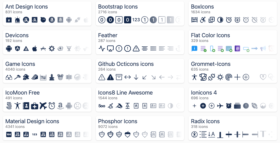
React Icons offers an integration of the all popular icon libraries for React, that include thouthands of icons, with install and how to use instructions.
Here is a list of the included icon sets:
- Ant Design Icons (
ai) - Bootstrap Icons (
bs) - BoxIcons (
bi) - Devicons (
di) - Feather Icons (
fi) - FontAwesome (
fa) - Game Icons (
gi) - Heroicons (
hi) - IcoMoon Free (
im) - Ionicons (
io) - Material Design Icons (
md) - Remix Icon (
ri) - Simple Icons (
si) - Typicons (
ti) - Weather Icons (
wi)
Each of these icon sets includes a variety of icons that can be easily integrated into React projects using the React Icons library.

2- Heroicons
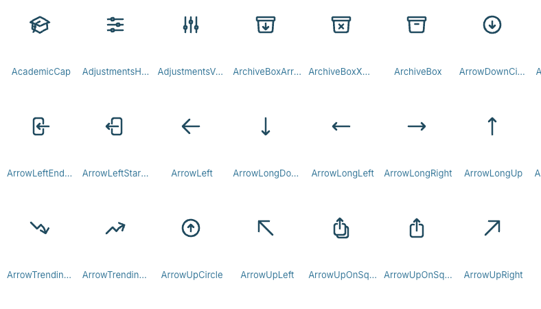
HeroIcons are amazing with its icon set as it offers different versions and sizes as 16 px, 20 px, and 24 px for solid and outline.
Hero Icons comes with many features as allowing developers to copy the code, as SVG, or in STRICT JSX format. developers also can export each icon as a component.
You can also download Figma file for free.
3- Iconoir
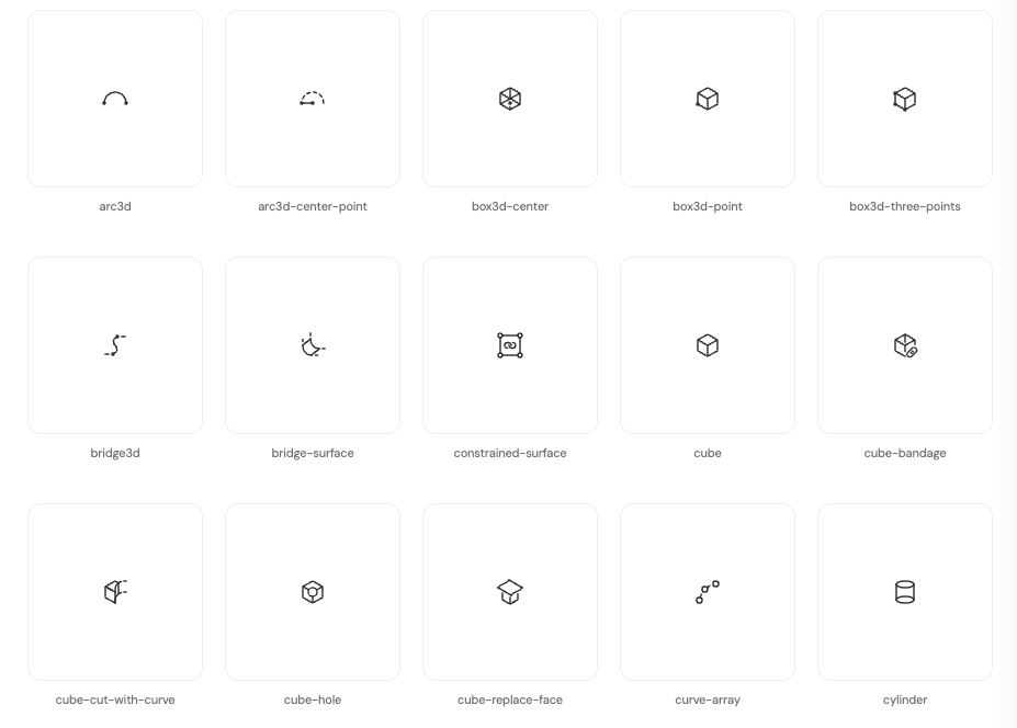
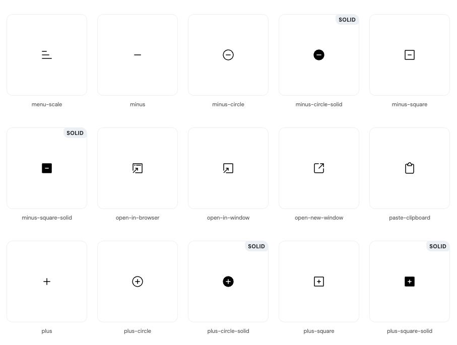
Iconoir is an open-source icon library designed for use in various projects, including web, mobile, and desktop applications. It provides a collection of over 1,300 SVG icons that are customizable and lightweight, making them suitable for modern design needs.
Iconoir's extensive collection, ease of customization, and compatibility with multiple platforms make it a valuable resource for designers and developers looking for a comprehensive icon solution.
You can also copy or download any icon as an SVG element directly to your project.
It is available for React, React Native, Vue, Flutter, Framer, and as a SwiftUI packages.
Install for React and React Native
# React
$ npm install iconoir-react

# React Native
$ npm install iconnoir-react-native
4- Feather icons
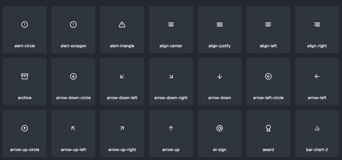
A Small icon library that i used over the years with React, Vue and Meteor projects. You can customize the size, stroke, and color for icons. It is easy to use it as an NPM package or directly as a CDN link.
Install with CDN
npm install feather-icons --saveCDN
<!-- choose one -->
<script src="https://unpkg.com/feather-icons"></script>
<script src="https://cdn.jsdelivr.net/npm/feather-icons/dist/feather.min.js"></script>
5- Iconify for React
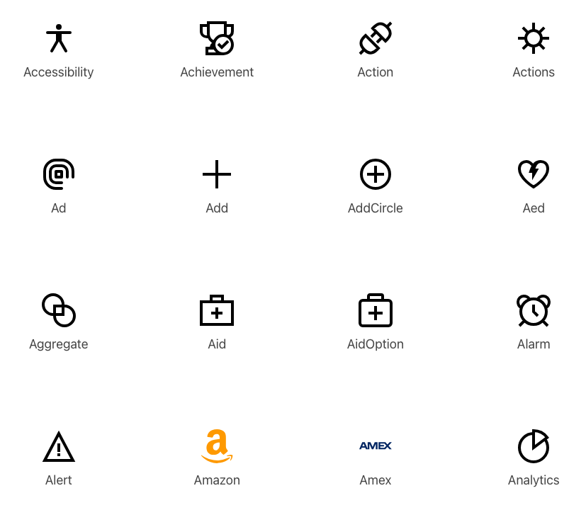
@iconify/react is a React component for using Iconify icons. It provides access to a vast collection of over 100,000 icons from more than 100 icon sets, all in a single library.
Features
- Wide Icon Selection: Includes icons from popular sets like FontAwesome, Material Design, and more.
- Easy Integration: Install via npm and use icons as React components.
- Customization: Supports customization of icon size, color, and rotation directly in your React components.
- Efficient Loading: Only loads the icons you use, optimizing performance and reducing bundle size.
- Open-Source: Available for free under the MIT license.
Install and use
To use @iconify/react, install it via npm, import the icon component, and include it in your React application. Customize icons easily by setting properties directly in your components.
# with NPM
npm install --save-dev @iconify/react

# yarn
yarn add --dev @iconify/react
import { Icon } from '@iconify/react';

# use
<Icon icon="mdi-light:home" />
6- Tabler Icons for React
@tabler/icons-react is a React library that provides a set of over 350 customizable SVG icons based on the Tabler Icons collection. These icons are optimized for performance and can be easily integrated into React applications.
Key Features:
- Extensive Icon Collection: Offers over 350 icons suitable for various use cases.
- Customization: Icons can be easily customized by adjusting size, color, and stroke width.
- Lightweight: The library focuses on performance with minimal impact on application size.
- Easy Integration: Simple to use with React components by installing via npm.
Usage:
Install @tabler/icons-react via npm, import the desired icons, and use them as components in your React application, customizing them as needed.
#yarn
yarn add @tabler/icons-react

# npm
npm install @tabler/icons-react

# pnpm
pnpm install @tabler/icons-react
import { IconArrowLeft } from '@tabler/icons-react';

const App = () => {
  return <IconArrowLeft />;
};

export default App;
7- IcoMoon-Free
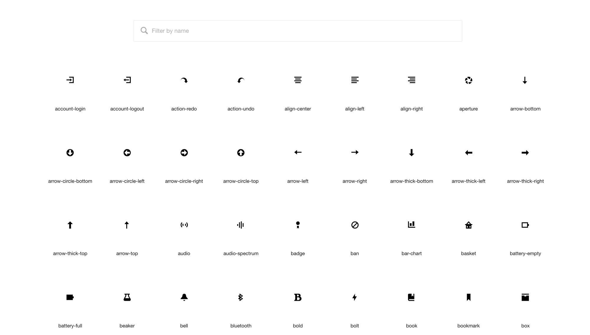
IcoMoon is a free, open-source icon set that provides a collection of 490 carefully designed vector icons. The icons are available in SVG and font formats, making them versatile for use in web and mobile applications.
Key Features:
- 490 Free Icons: A variety of icons covering multiple categories, all available for free.
- Multiple Formats: Icons are provided in both SVG and font formats, making them adaptable for different projects.
- Optimized Design: Each icon is meticulously crafted to ensure clarity and visual consistency.
- Open-Source: Available under the GPL and CC BY licenses, allowing for free use and modification in personal and commercial projects.
Usage:
To use IcoMoon-Free, you can download the icons from the GitHub repository or include them via CDN in your projects. Customize the icons by editing SVGs or using the font files as needed.
8- css.gg
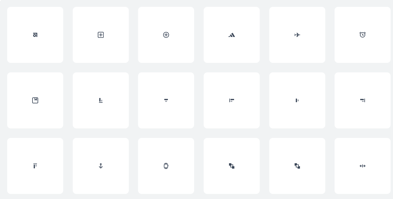
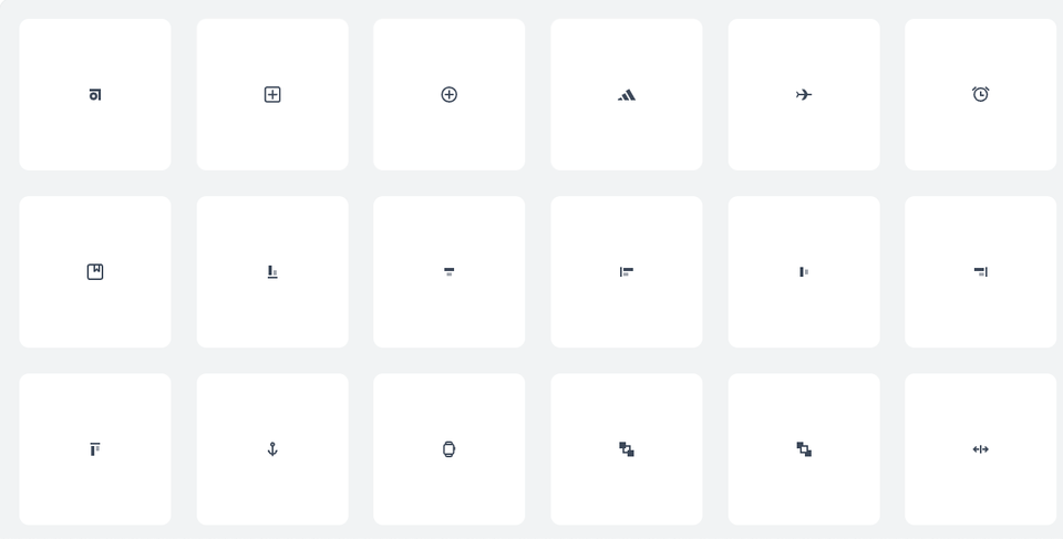
CSS.gg provides a set of over 700 open-source CSS and SVG icons, including the "Abstract" icon, which is part of this collection. The icons are designed to be lightweight and easily customizable, making them suitable for modern web and mobile applications.
It also offers a Figma file that you can download and use directly in Figma.
Key Features of the "Abstract" Icon:
- Scalable and Lightweight: The "Abstract" icon is available in CSS and SVG formats, ensuring scalability and minimal load impact.
- Easy Customization: Icons can be easily customized using CSS, allowing for adjustments in size, color, and animations.
- Open-Source: The icons are free to use under the MIT license, making them accessible for both personal and commercial projects.
- Simple Integration: Icons can be integrated by copying the provided HTML and CSS, or by using the SVG directly.
Usage:
To use the "Abstract" icon from CSS.gg, simply include the CSS stylesheet or SVG in your project, and apply any desired customizations through CSS to fit your design needs.
9- Boxicons
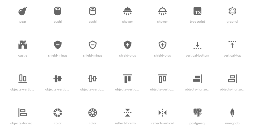
Boxicons is a simple and free icon library designed for use in web and mobile applications. It offers over 1,200 icons in SVG, web font, and other formats, covering a wide range of categories, including user interface elements, weather, social media, and more.
Features
- Extensive Icon Set: Provides over 1,200 icons suitable for various design needs.
- Customizable: Icons are easy to customize in terms of size, color, and style to fit different projects.
- Multiple Formats: Available in SVG, web font, and other formats for flexible integration.
- Free to Use: Open-source and free for personal and commercial use under the MIT license.
- Simple Integration: Easy to include in projects by linking to the CDN or downloading the icon set.
- Use directly or as a web component.
Use and install
To use Boxicons, you can add them to your project by including a CDN link or downloading the icons and incorporating them as needed. Customization can be done through CSS for styling to match your design preferences.
$ npm install boxicons --saveUse
import 'boxicons';


<i class="bx bx-hot"></i>
<i class="bx bxs-hot"></i>
<i class="bx bxl-facebook-square"></i>

// or
<box-icon name="hot"></box-icon>
10- Remix Icon
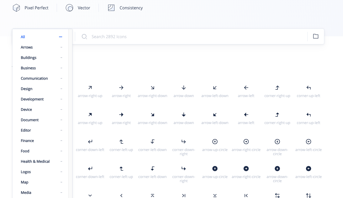
Remix Icon is an open-source collection of neutral-style system symbols designed for both designers and developers. Featuring over 2,800 meticulously crafted icons, this library ensures readability, consistency, and precise pixel quality.
Each icon comes in two styles: "Outlined" and "Filled," all based on a 24x24 grid. All icons are free to use for personal and commercial projects.
You can use it as an NPM package easily or directly from the CDN. Remix Icon is an ideal library for React, and Vue. If you are using Figma, you can also use the official RemixIcon Figma plugin.
Install and Use
npm install remixicon --saveimport 'remixicon/fonts/remixicon.css'
<i class="ri-admin-line"></i>
<i class="ri-admin-fill"></i>Download for React
npm install @remixicon/react
# or
yarn add @remixicon/react
# or
pnpm install @remixicon/react
Use with React
import { RiHeartFill } from "@remixicon/react";

const MyComponent = () => {
    return (
        <RiHeartFill
            size={36} // set custom `width` and `height`
            color="red" // set `fill` color
            className="my-icon" // add custom class name
        />
    );
};