Boost Your React Apps with Interactive Data Tables, 17 Open-source Free Options
Table of Content
In the world of modern web development, React has become the go-to library for building dynamic user interfaces. One crucial component that can elevate your React applications to the next level is the DataTable. Let's dive into why DataTables are essential and how they can transform your React projects.
What is a React DataTable?
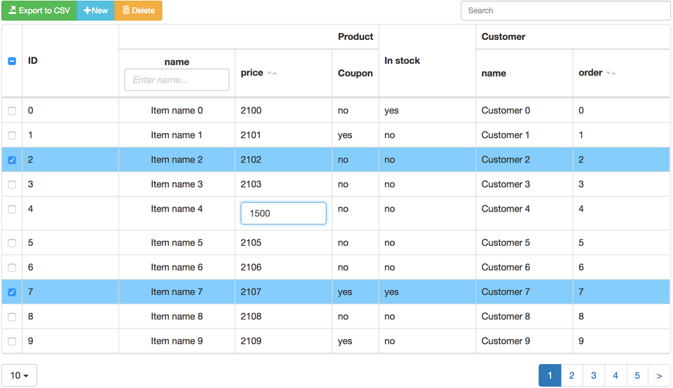
A React DataTable is a powerful component that renders large sets of structured data in a grid format, leveraging React's efficiency and component-based architecture. It's not just about displaying data; it's about creating an interactive, user-friendly experience that aligns perfectly with React's philosophy of building reusable UI components.
Key Features of React DataTables:
- Virtual DOM Optimization: Efficiently render thousands of rows without performance hiccups.
- State Management Integration: Seamlessly work with Redux or Context API for global state handling.
- React Hooks Compatibility: Utilize useState, useEffect, and custom hooks for enhanced functionality.
- JSX Syntax: Declaratively define table structure and behavior using JSX.
Why React Developers Need Interactive Data Tables
In the React ecosystem, interactive DataTables are more than just a nice-to-have—they're a game-changer. Here's why:
- Single Page Application (SPA) Enhancement: Perfect for React SPAs, allowing data manipulation without page reloads.
- Component Reusability: Create a DataTable component once, reuse it across your entire React application.
- React Native Compatibility: Many React DataTable libraries offer React Native support for mobile app development.
- Integration with React Ecosystems: Seamlessly integrate with popular React UI libraries like Material-UI or Ant Design.
React DataTables in Action: Use Cases
- React Admin Dashboards: Build powerful admin interfaces with real-time data updates and interactive filtering.
- E-commerce Product Management: Create dynamic product catalogs with React's state management for instant updates.
- Financial Data Analysis: Leverage React's performance for handling large datasets in real-time financial applications.
- Social Media Content Management: Efficiently manage user-generated content with sortable and filterable React tables.
Ready to supercharge your React applications? In the next section, we'll explore 17 Free and Open-source React DataTable Libraries that will empower you to create stunning, high-performance data-driven interfaces. Get ready to take your React development skills to the next level!
But before we start, If you are looking for other useful free open-source React libraries to boost your apps, we recommend checking our collections in the following list:
- React charts libraries for Data visualization
- Free React Maps libraries
- React Image, Gallery and Lightbox libraries
- Free open-source React Dashboards and control panels
- React animation libraries
DataTable Libraries for React
1- React Cool Virtuals
This open-source library offers a tiny React hook for rendering large datasets like a breeze.
Features
- 🦔 Tiny size (~ 3.1kB gzipped). No external dependencies, aside from the react.
- 🚚 Built-ins load more callback for dealing with infinite scroll and skeleton screens.
- 🎛 Super flexible API design, built with developer experience in mind.
- 🧱 Supports fixed, variable, dynamic, and real-time heights/widths.
- 🛹 Out-of-the-box smooth scrolling with customizable effects.
- 📜 Supports TypeScript type definition.
- 🖱 Imperative scroll-to methods for offset, items, and alignment.
- ♻️ Renders millions of items with highly performant way, using DOM recycling.
- 💅🏼 Apply styles without hassle, with just a few setups.
- 🗄️ Supports server-side rendering (SSR) for fast First Paint and First Contentful Paint, and better SEO.
- 📌 Supports sticky headers for building on-trend lists.
- 🎣 Easy to use, based on React hook.
- 💬 Possible to implement stick to bottom and pre-pending items for chat, feeds, etc.
- ⛳ Provides isScrolling indicator for UI placeholders or performance optimization.
- 🖥 Supports responsive web design (RWD) for better user experience..
Install and Use
$ yarn add react-cool-virtual
# or
$ npm install --save react-cool-virtual
Usage
import useVirtual from "react-cool-virtual";

const List = () => {
  const { outerRef, innerRef, items } = useVirtual({
    itemCount: 10000, // Provide the total number for the list items
    itemSize: 50, // The size of each item (default = 50)
  });

  return (
    <div
      ref={outerRef} // Attach the `outerRef` to the scroll container
      style={{ width: "300px", height: "500px", overflow: "auto" }}
    >
      {/* Attach the `innerRef` to the wrapper of the items */}
      <div ref={innerRef}>
        {items.map(({ index, size }) => (
          // You can set the item's height with the `size` property
          <div key={index} style={{ height: `${size}px` }}>
            ⭐️ {index}
          </div>
        ))}
      </div>
    </div>
  );
};2- React Data Table Component
React Data Table Component is a free library for creating tables in React applications.
Key points include:
- Declarative configuration
- Built-in sorting and pagination
- Selectable and expandable rows
- Customizable themes
- Accessibility
- Responsive design
3- TanStack Table v8
TanStack Table is a flexible, headless table library that provides core functionality without pre-built components or styles.
This design gives developers complete control over the table's appearance and implementation, allowing for customization with various styling methods like CSS, CSS-in-JS, or UI component libraries.
Its versatility extends to different platforms, including React Native, making it a highly adaptable solution for diverse project needs.
Features
- Agnostic core (JS/TS)
- 1st-class framework bindings for React, Vue, Solid
- ~15kb or less (with tree-shaking)
- 100% TypeScript (but not required)
- Headless (100% customizable, Bring-your-own-UI)
- Auto out of the box, opt-in controllable state
- Filters (column and global)
- Sorting (multi-column, multi-directional)
- Grouping & Aggregation
- Pivoting (coming soon!)
- Row Selection
- Row Expansion
- Column Visibility/Ordering/Pinning/Resizing
- Table Splitting
- Animatable
- Virtualizable
- Server-side/external data model support
4- MUI-Datatables
MUI-Datatables is a responsive datatables component built on Material-UI. It comes with features like filtering, resizable columns, view/hide columns, draggable columns, search, export to CSV download, printing, selectable rows, expandable rows, pagination, and sorting.
On top of the ability to customize styling on most views, there are three responsive modes "vertical", "standard", and "simple" for mobile/tablet devices.
Install and use
npm install mui-datatables --save

# If your project doesn't already use them, you need to install mui v5 and # it's icon pack:
npm --save install @mui/material @emotion/react @emotion/styled @mui/icons-material
5- React Datatable
ReactDatatable is a component which provide ability to create multifunctional table using single component like jQuery Datatable. It's fully customizable and easy to integrate in any react component. Bootstrap compatible.
Features
- Lightweight
- Fully customizable (JSX, templates, state, styles, callbacks)
- Client-side & Server Side Pagination
- Multi-sort
- Filters
- Minimal design
- Fully controllable via optional props and callbacks
- Dozens of custom features
Install
npm i @ashvin27/react-datatable6- @o2xp/react-datatable
React-datatable is another powerful table component library for React applications. Here are some key features and information about this library:
- Highly customizable: Offers extensive options for customizing the appearance and behavior of tables
- Server-side pagination: Supports efficient handling of large datasets through server-side pagination
- Sorting and filtering: Provides built-in functionality for sorting and filtering table data
- Responsive design: Ensures tables are responsive and work well on various screen sizes
- Theming support: Allows easy customization of the table's look and feel through theming
React-datatable aims to provide a balance between flexibility and ease of use, making it suitable for a wide range of projects. It's particularly useful for applications that require complex data representation with advanced features like server-side operations.
7- React Smart Data Table
A smart data table component for React.js meant to be configuration free, batteries included.
React-smart-data-table is a configuration-free, feature-rich data table component for React.js. It's designed with a "plug and play" philosophy, allowing developers to quickly implement sophisticated tables with minimal setup.
This component takes an array of JSON objects and automatically generates a customizable table. It's ideal for projects that require rapid development and easy integration. For developers needing more granular control, the creators recommend checking out the react-very-simple-data-table alternative.
Key features of react-smart-data-table include:
- Automatic column naming and smart data rendering
- Intelligent handling of URLs, emails, booleans, and images
- Sortable columns with custom sort function support
- Advanced search and filtering capabilities
- Search term highlighting in results
- Column visibility toggles
- Built-in pagination and server-side data support
- Customization options
- Control over row clicks and column order
- Custom components and pagination
These features make react-smart-data-table a versatile solution for various table needs in React applications, balancing ease of use with powerful functionality.
8- Material Table
Material Table is based on Google’s Material Design principles, providing a sleek, user-friendly interface with all the essential functionalities needed to handle complex datasets. Its built-in features, coupled with its integration with Material-UI, make it a great choice for developers who need a robust, yet flexible, data table solution.
Features
- Sorting
Material Table allows users to easily sort data by clicking on column headers, offering both ascending and descending order for every column. - Filtering
Built-in column filtering allows users to quickly filter the dataset by typing in values in the column-specific search fields. - Pagination
Material Table provides out-of-the-box pagination functionality with customizable rows per page, making it easier to manage and display large datasets. - Customizable Columns
The table allows full control over the columns, from hiding columns, setting specific widths, or adding custom renderers for columns. - Export Options
Users can export table data as CSV, Excel, or PDF files with just a few clicks, which makes sharing and exporting data seamless. - Editable Rows
One of the standout features of Material Table is its ability to allow inline editing of table rows. Users can modify the data directly within the table without navigating away from the page. - Grouping and Aggregation
Material Table supports grouping rows by column values, making it easier to analyze data in categorized formats. This feature is ideal for reports or data analysis apps. - Localization
The library supports multiple languages, making it a perfect fit for global applications that need localization in the data table. - Row Selection
Users can select one or multiple rows for further actions such as bulk editing, exporting, or deleting. - Responsive Design
Material Table is designed with responsiveness in mind, ensuring that your data tables look and function beautifully on both desktop and mobile devices. - Actions and Custom Buttons
Developers can easily add custom action buttons for each row or for bulk actions on selected rows, providing additional interactivity and functionality. - Customizable Themes
Thanks to Material-UI integration, developers can customize the table’s look and feel to match their application’s theme seamlessly.
Install
#npm
npm install material-table @material-ui/core --save
# yarn
yarn add material-table @material-ui/core
Add Material Icons
<link
  rel="stylesheet"
  href="https://fonts.googleapis.com/icon?family=Material+Icons"
/>9- React Table Library
React Table Library -- an almost headless table library -- which prioritizes:
- opt-in feature richness
- built-in themes and custom theming
- server-side operations as first-class citizens
- small library size
- pleasant developer experience
- TypeScript support
- SSR support
Install
# npm
npm install @table-library/react-table-library @emotion/react
# yarn
yarn add @table-library/react-table-library @emotion/react
Use
import { CompactTable } from '@table-library/react-table-library/compact';

const nodes = [
  {
    id: '0',
    name: 'Shopping List',
    deadline: new Date(2020, 1, 15),
    type: 'TASK',
    isComplete: true,
    nodes: 3,
  },
];

const COLUMNS = [
  { label: 'Task', renderCell: (item) => item.name },
  {
    label: 'Deadline',
    renderCell: (item) =>
      item.deadline.toLocaleDateString('en-US', {
        year: 'numeric',
        month: '2-digit',
        day: '2-digit',
      }),
  },
  { label: 'Type', renderCell: (item) => item.type },
  {
    label: 'Complete',
    renderCell: (item) => item.isComplete.toString(),
  },
  { label: 'Tasks', renderCell: (item) => item.nodes },
];

const Component = () => {
  const data = { nodes };

  return <CompactTable columns={COLUMNS} data={data} />;
};
10- React Datatable
A react.js datatable, built to work out of the box but also be customisable with little effort.
Features
- Sorting
- Multi Sorting
- Number filter
- Text filter
- Boolean filter
- Set filter
- Pagination
- Toggleable columns
- A Seperate controller from component, to allow customization.
- Added client sided data manipulation
- Editable cells
- Cell validation on edit
11- React Bootstrap Table

React Bootstrap Table 2 is a powerful and feature-rich table component for React applications, built on top of React Bootstrap. This library offers a wide range of functionalities to create dynamic and interactive tables with ease.
Key features of React Bootstrap Table 2 include:
- Sorting: Built-in support for column sorting
- Pagination: Efficient handling of large datasets with customizable pagination
- Search: Powerful search functionality across table data
- Column Filtering: Ability to filter data based on column values
- Cell Editing: In-line editing capabilities for table cells
- Row Selection: Support for selecting single or multiple rows
- Row Expansion: Expandable rows for displaying additional information
- Column Resizing: Ability to resize columns dynamically
- Custom Styling: Extensive options for customizing the table's appearance
- Remote Data Handling: Support for server-side operations like sorting and filtering

12- Rc Table
React table component with useful functions that can add dynamic data tables to your project with ease.
13- Fixed Data Tables for React
FixedDataTable is a React component for building and presenting data in a flexible, powerful way. It supports standard table features, like headers, columns, rows, header groupings, and both fixed-position and scrolling columns.
Features
- Fixed headers and footer
- Both fixed and scrollable columns
- Handling huge amounts of data
- Variable row heights (with adaptive scroll positions)
- Column resizing
- Performant scrolling
- Customizable styling
- Jumping to a row or column
- Controlled scroll API allows touch support
14- @decathlon/react-table
React components for efficiently rendering large tabular data.
15- React Table Again
Hooks for building lightweight, fast and extendable datagrids for React.
Features
- Lightweight (5kb - 14kb+ depending on features used and tree-shaking)
- Headless (100% customizable, Bring-your-own-UI)
- Auto out of the box, fully controllable API
- Sorting (Multi and Stable)
- Filters
- Pivoting & Aggregation
- Row Selection
- Row Expansion
- Column Ordering
- Animatable
- Virtualizable
- Resizable
- Server-side/controlled data/state
- Extensible via hook-based plugin system
16- React Base Table
BaseTable is a react table component to display large datasets with high performance and flexibility.
Install
# npm
npm install react-base-table --save

# yarn
yarn add react-base-table
Use
import BaseTable, { Column } from 'react-base-table'
import 'react-base-table/styles.css'
// Important: if you fail to import react-base-table/styles.css then
// BaseTable will not render as advertised in the included examples.
// For advanced styling see link below:
// https://github.com/Autodesk/react-base-table#advance
 ...
<BaseTable data={data} width={600} height={400}>
  <Column key="col0" dataKey="col0" width={100} />
  <Column key="col1" dataKey="col1" width={100} />
  ...
</BaseTable>
...17- React Data Table Component
A responsive table library with built-in sorting, pagination, selection, expandable rows, and customizable styling.
Features
- Declarative configuration
- Built-in and configurable:
- Sorting
- Selectable Rows
- Expandable Rows
- Pagination
- Themeable/Customizable
- Accessibility
- Responsive (via x-scroll/flex)

