20 Open-source and Free React UI Components Libraries


Are You Truly Ready to Put Your Mobile or Web App to the Test?
Don`t just assume your app works—ensure it`s flawless, secure, and user-friendly with expert testing. 🚀
Why Third-Party Testing is Essential for Your Application and Website?We are ready to test, evaluate and report your app, ERP system, or customer/ patients workflow
With a detailed report about all findings
Contact us nowTable of Content
React is an open-source JavaScript framework that is popular for building comprehensive and fully functional web applications. It is easy to use, reliable, and flexible, and has a vast community of developers. React has a thriving ecosystem of libraries, frameworks, tutorials, and open-source projects. It is the preferred choice for developers looking to build robust and feature-packed applications that can run seamlessly across multiple platforms.
React UI user-interface component libraries are collections of pre-designed, ready-to-use components that make it easier and faster for developers to create user-friendly interfaces without building everything from scratch. These collections can include everything from basic buttons and form elements to complex data visualization tools and interactive widgets.
 Hamza Mousa
In this post, we present a comprehensive collection of the most popular and feature-rich open-source and free UI components libraries for React. Whether you're a beginner or an experienced developer, these libraries will help boost your productivity and streamline your workflow so you can focus on building the best possible user experiences for your applications.
1- Monday: Vibe Design System
Monday is a free open-source (MIT licensed) rich components' library for React. It includes all the basic UI components such as buttons, button groups, colors, form elements, accordions, dialogs, tooltips, and more. Moreover, Monday also supports Motion animation by default, and external fonts.
Here is a special Monday.com Promo Code.
 mondaycom
 Cha Nam Koh
2- CoreUI
CoreUI React.js UI Components. CoreUI for React.js replaces and extends the Bootstrap JavaScript. Components have been built from scratch as true React.js hook components, without jQuery and unneeded dependencies.
coreui3- TDesign
TDesign React is a UI component library for React 16.x and desktop application. It works well for other frameworks like Electron. It also comes with many desktop application interactions APIs. However, the English documentation is not final yet.
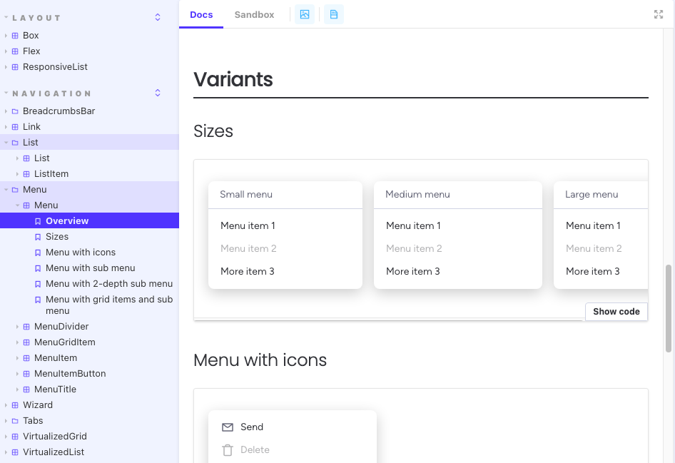
Tencent4- Fluent UI
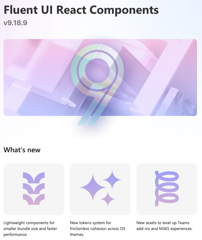
Fluent UI web represents a collection of utilities, React components, and web components for building web applications. It is totally a free to use and open-source that is licensed under the MIT license.
microsoft5- React UI
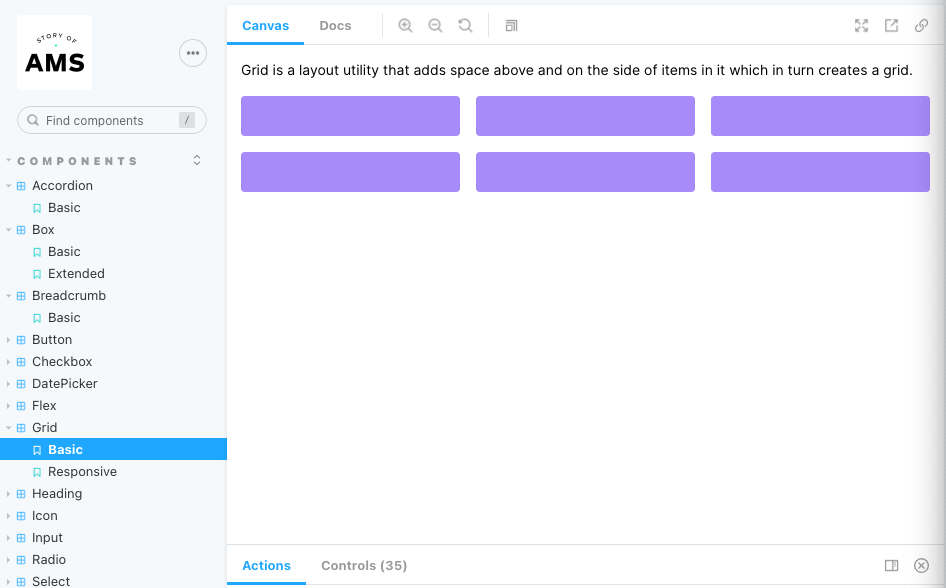
This project is a collection of UI components build to create a production grade front-end experience with react & Next.js.
storyofams6- PrimeReact
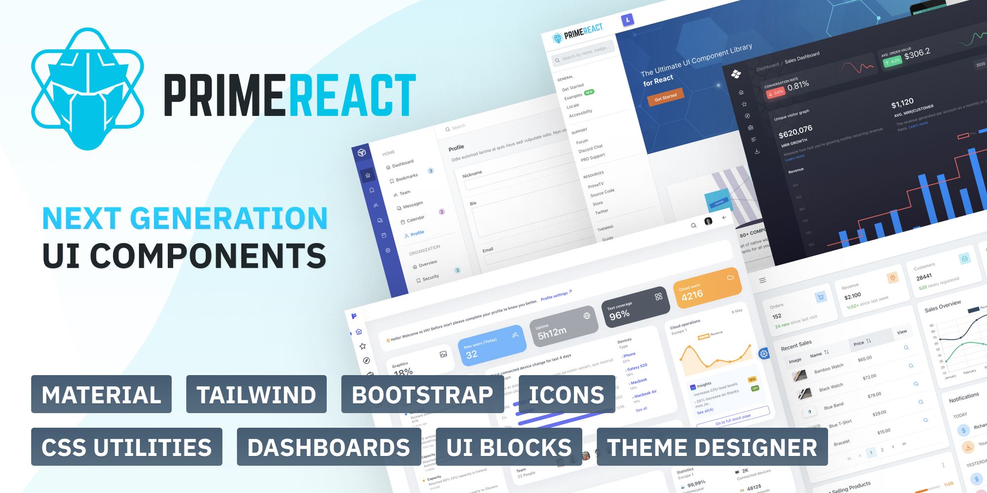
PrimeReact is a rich set of open source UI Components for React. It is an ideal option for creating rich apps, dashboards, and admin panels.
primefaces7- Chakra UI
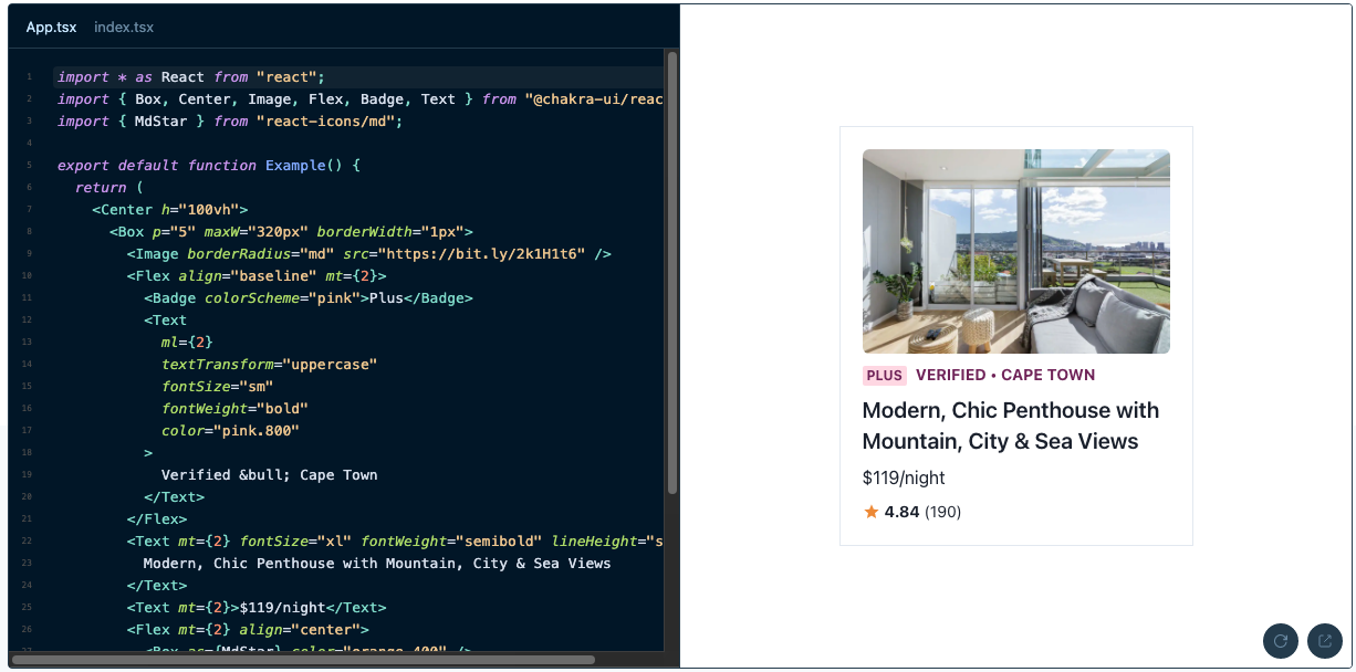
Chakra UI is a comprehensive library of accessible, reusable, and composable React components that streamlines the development of modern web applications and websites. The library offers a diverse range of components that can be easily combined to build complex user interfaces while adhering to accessibility best practices.
chakra-ui8- MUI Core and MUI X
MUI Core: Ready-to-use foundational React components, free forever. It includes Material UI, which implements Google's Material Design.
MUI X is based on Advanced and powerful React components for complex use-cases. It includes data grid, date/ time pickers, an

9- Gestalt
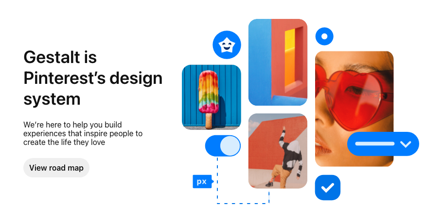
Gestalt is Pinterest’s design system. Our system includes a React component library with comprehensive guidelines, best practices, tools, and resources to support designers and engineers delivering a high-quality product.
pinterest10- shadcn/ui
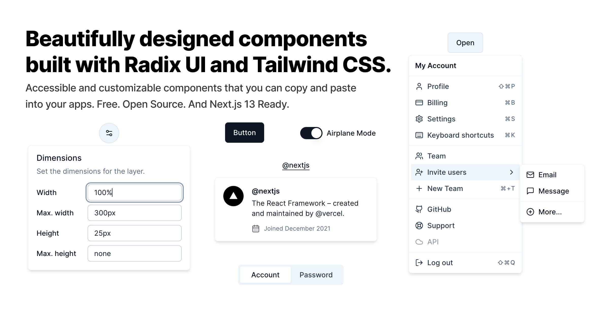
shadcn/ui is a free accessible and customizable components for Next.js apps set that you can copy and paste into your apps. It uses Radix UI, Tailwind CSS, and dark theme support that is compatible with Next-themes.
shadcn11- UI Box

ui-box is a low level CSS-in-JS solution that focuses on being simple, fast and extensible. All CSS properties are set using simple React props, which allows you to easily create reusable components that can be enhanced with additional CSS properties. This is very useful for adding things like margins to components, which would normally require adding non-reusable wrapper elements/classes.
segmentio12- Amplify UI
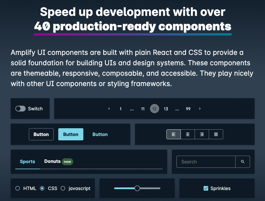
Amplify UI is an open-source UI library with cloud-connected components that are endlessly customizable, accessible, and can integrate into any application. Amplify UI consists of:
- Connected components that simplify complex cloud-connected workflows, like Authenticator.
- Primitive components that create consistency across Amplify UI and allow you to build complete applications that fit your brand, like Buttons and Badges.
- Data-bound components that make it easy to display dynamic data, like DataStoreCollections.
- Theming capabilities that allow you to customize the appearance of Amplify UI to match your brand.
aws-amplify13- Mantine
Mantime is a features-rich open-source fully featured React components library.
mantinedev14- Flowbite-React
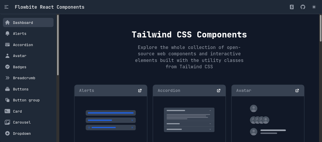
Flowbite-React is an open source collection of UI components, built in React, with utility classes from Tailwind CSS that you can use as a starting point for user interfaces and websites.
themesberg15- Grommet
Grommet is a react-based framework that provides accessibility, modularity, responsiveness, and theming in a tidy package.
grommet16- Ant Design
Ant Design is an enterprise-class UI design language and React UI library. It supports internationalization and theming out of the box.
ant-design17- Rebass
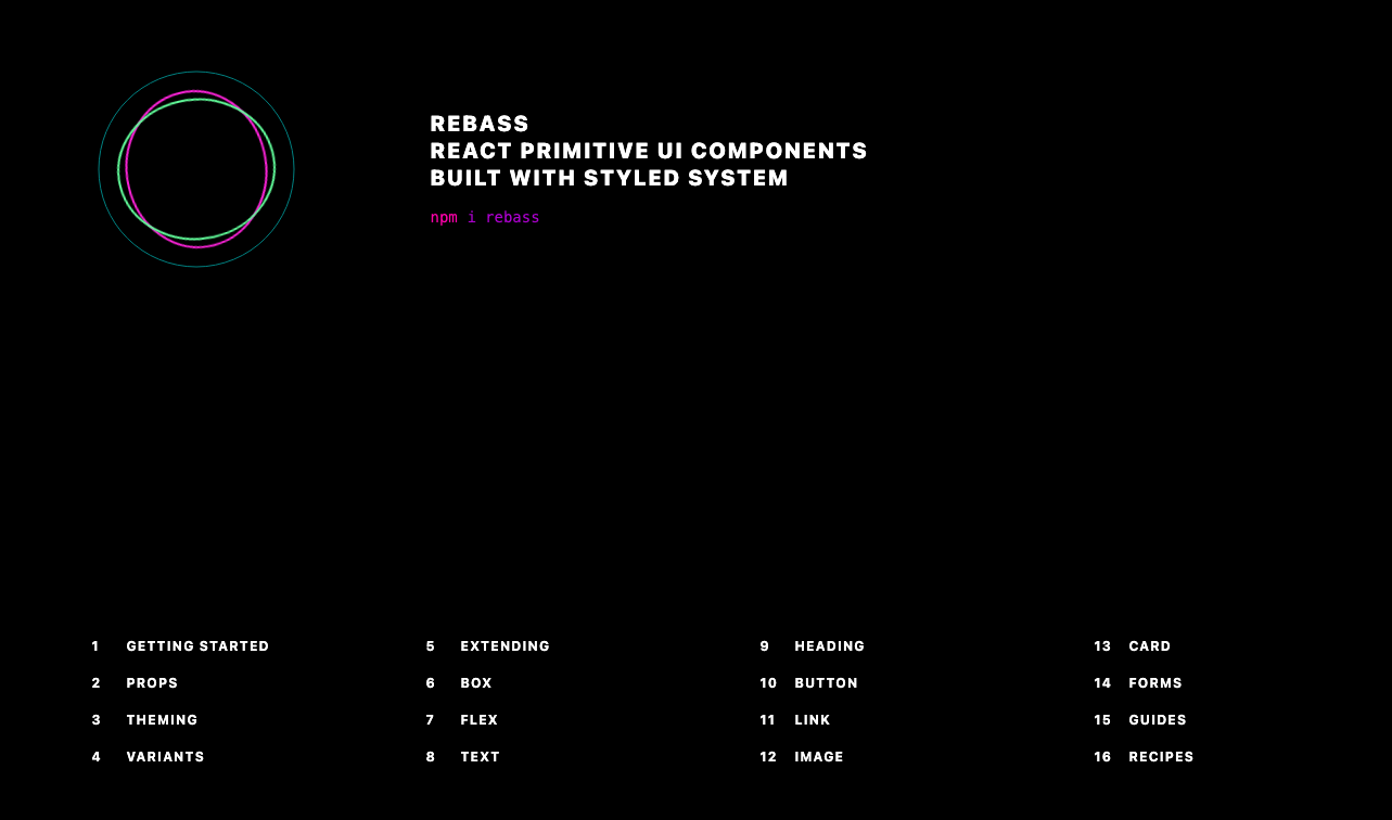
Rebase is a free and open-source (MIT) React primitive UI components built with styled-system.
Rebass features include:
- Start your design system without boiling the ocean
- Build consistent UI with design constraints and user-defined scales
- Best-in-class developer ergonomics with Styled System props
- First-class support for theming & fully compatible with Theme UI
- Quick, mobile-first responsive styles with array-based syntax
- Flexbox layout with the Box and Flex components
- Flexibility built in for high design & development velocity
- Minimal footprint at about 4 KB

18- NextUI
Hamza Mousa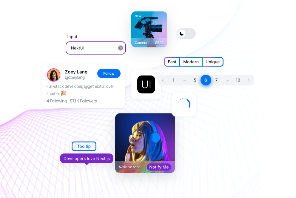
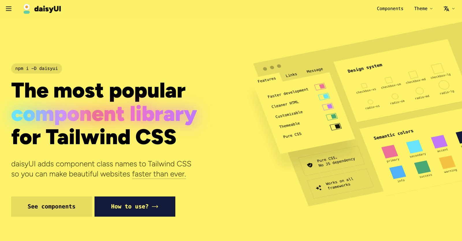
19- Daisy UI
Daisy UI is a powerful open-source library of Tailwind components featuring 29 themes. It supports Vue, React, Meteor, and Angular, providing developers with more options. Customizing your web applications is easy with Daisy UI's Tailwind configuration file. The library has a variety of stunning and professional themes for different niches and areas of expertise. Utilizing Daisy UI can help you create beautiful and responsive web applications in less time and with less effort, making it an invaluable tool for both experienced professionals and beginners in web development.
20- gust UI
labXDHamza Mousa Hamza Mousa
 Hamza Mousa
 Hamza Mousa